Change, positive & negative..hmmm… What I decided to do was take a different stance on the idea of change – how a design can change before you eyes depending on whether you’re looking at the positive or negative space of the design. So to start with I had a play with some shiva (markel) paintsticks and a frezzer paper stencil.
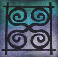

Here is two versions, one on black and one on blue. The black version works better for two reasons: I did an undercoat of white before colouring thus getting better coverage and secondly black gives better contrast. Now the positive/negative thing: depending if you concentrate on the plain background or the multi-coloured areas, the design elements alter. It takes a bit of mental gymnastics and I’ve realised I needed more equal areas of multi-colour and background to really get the mind confused about what to focus on!
Its fun playing with this sort of thing. I choose spirals because for me they represent change. Next step I think is to quilt it down and perhaps add some other embellishment. See what happens next week – it may change completely!

April 17, 2008 at 11:37 am |
These are great – I love the design. I’m not very good at the mental gymnastics though!
April 17, 2008 at 6:32 pm |
That’s a very neat interpretation of the theme!
April 17, 2008 at 11:57 pm |
These look great – I am trying to get a sense of the dimensions? Are they fairly big? I really like your thinking behind your TIF projects – very stimulating!!
April 18, 2008 at 2:41 am |
Interesting contrast between the two. Like what you’ve done so far.
April 18, 2008 at 1:01 pm |
These are great! I really like the background on the black one.
April 19, 2008 at 8:00 pm |
this turned out very nice, I like your background painting. Its seems to be harder to do the negative that I thought it would be, good job.